Andrey Erenkov and Konstantin Kuznetsov from DAUP really wanted a new logo for their Department to be created by Manufactura. They had long been following updates in our portfolio and style and firmly believed that we could do another really special thing for our city. For us it has been perhaps the most positive and rewarding experience of working in cooperation with executive bodies of state power. Thank you, Andrey! Thank you, Konstantin!
Shall we now have a look at what we’ve done?
DAUP, or the Department of Architecture and Urban Planning of the Voronezh Region, is the executive governmental body responsible for implementing the state policy in architecture and urban planning.
LC
Logo concept
What kind of logo did we want to create for the local government? Tendentious. Acid. Breaking patterns. We want to see a new and modern government, not like us. Some people in the government want it too. Never a coat of arms, no vultures or lions – that’s for sure. We didn’t even suggest such options, we refused even to think that way. Don’t want to get approval for something you don’t want? Don’t show it – simple as that.

Architecture, an anchor and compass. Voronezh, buildings and an angle. We juggled with the icons of these notional symbols looking for that cryptic something, similar to the signs of craft guilds which used to greet visitors to a town years back.

The second concept was born out of cartography. Streets of the city, city maps with differently hatched areas, and the acronym of the organization name. All this prompted an interesting shape of a crossroads, styled as a map fragment and encoding the initial letters of the organization name.
This version got approved. Yes! It's good. Nothing to be ashamed of later.
clrs
Сolors
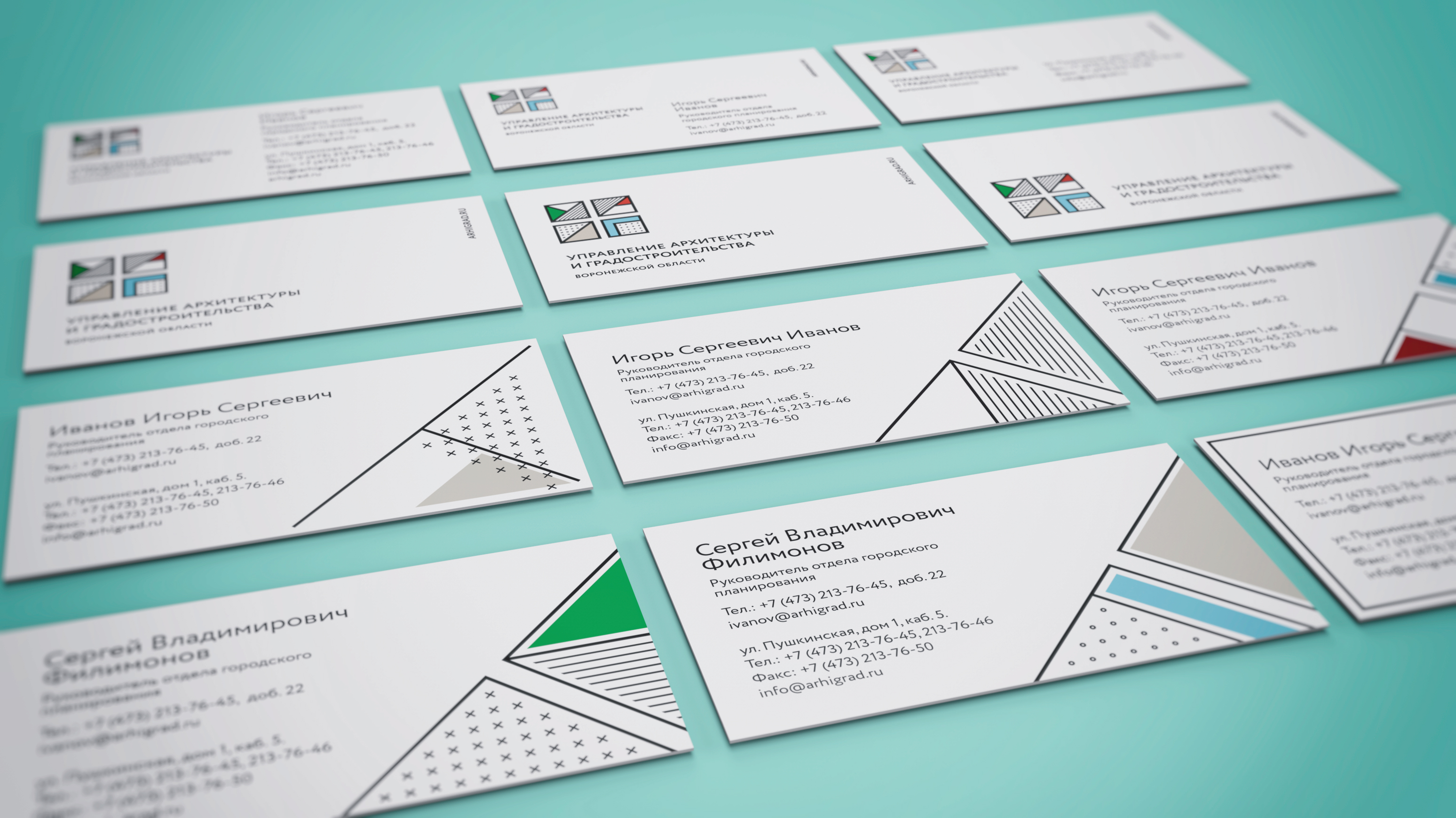
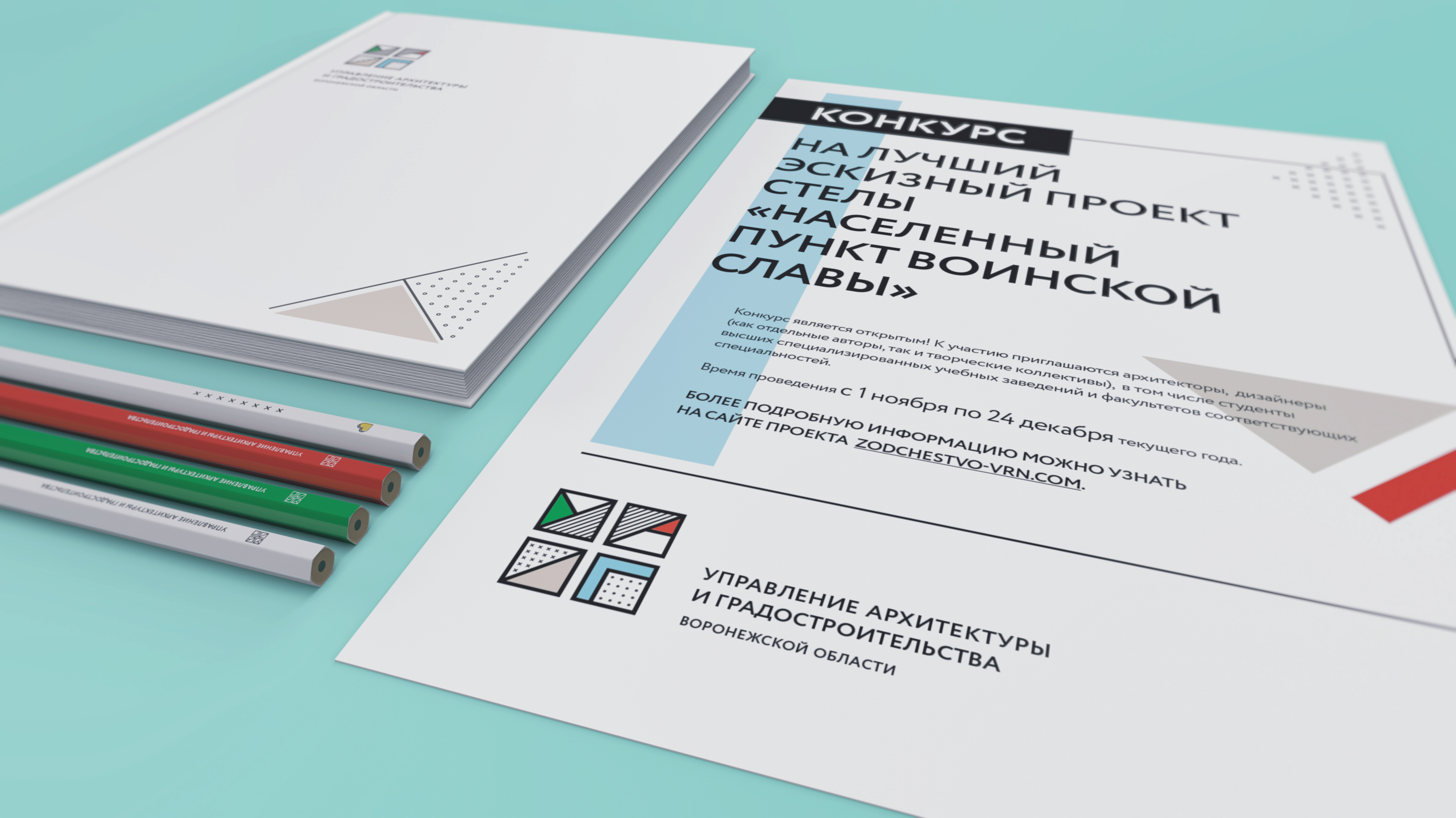
We used city maps again in search of corporate colors. We pinpointed the shades found on the maps, identified them in PANTONE, and recorded their numbers for printing.
And off we went to "paint" the logo.
LG
Logo
prmMT
Promo materials
We went on playing with crossroads, maps, patchiness, and hatching. Each business card carries a fragment of the sign; the business cards can be put together to make city road junctions.
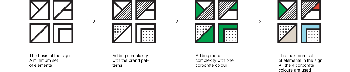
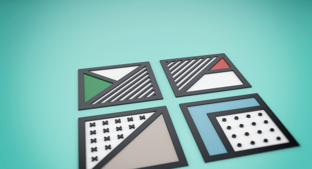
Along the way, we came up with a few more symbols that we did not want to abandon. Gonna use them whenever there’s a good chance.
Notepads, pencils, certificates – this is how the logo will work on different media.
WBST
Website
A corporate website is still another media and a way to promote a corporate identity. Our idea that design for the government can look modern was in tune with our client’s ideas of creating a resource which would not only have weight in matters of compliance with standards and requirements but also be useful and relevant for professionals and ordinary people in the city.


EKR
Erken Kagarov's review
Someone (it wasn’t not us!) submitted the logo we had developed for DAUP to Artemy Lebedev’s Business Lynch. Well, it feels like an extreme sport to be the first to click open the Studio Art Director’s feedback.
«Can such a logo make a state body people-centric and make it look more human, modern, and transparent?» a user nicknamed Asd asks.
Well, if you take a look at the comments to the Lynch, you might have great fun. People play with the logo. People identify with this solution. This is good, isn’t it. And whether it has made the state body people-centric is a matter of time. The first step has been taken.
ИHere’re some of the most notable comments we’ve selected.


